Matchwell
Redesigning the Clinician Experience to Remove Friction and Drive Engagement
A full redesign of Matchwell’s Work App focused on job discovery, credential transparency, and task confidence.
Overview
Problem
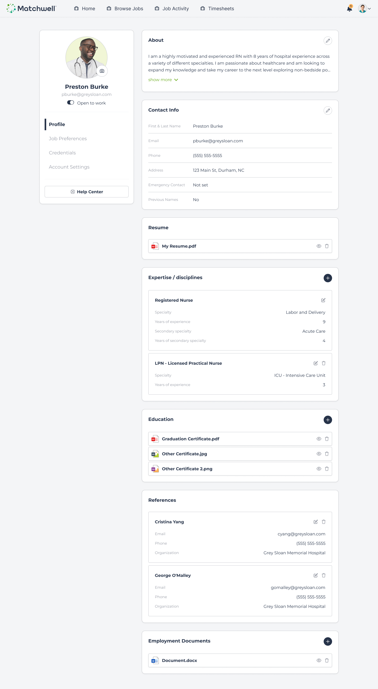
When I joined Matchwell, clinicians faced significant friction when trying to apply for jobs and manage their schedules. The experience was confusing both visually and conceptually, leading to frequent support requests and low confidence in task completion.
Solution
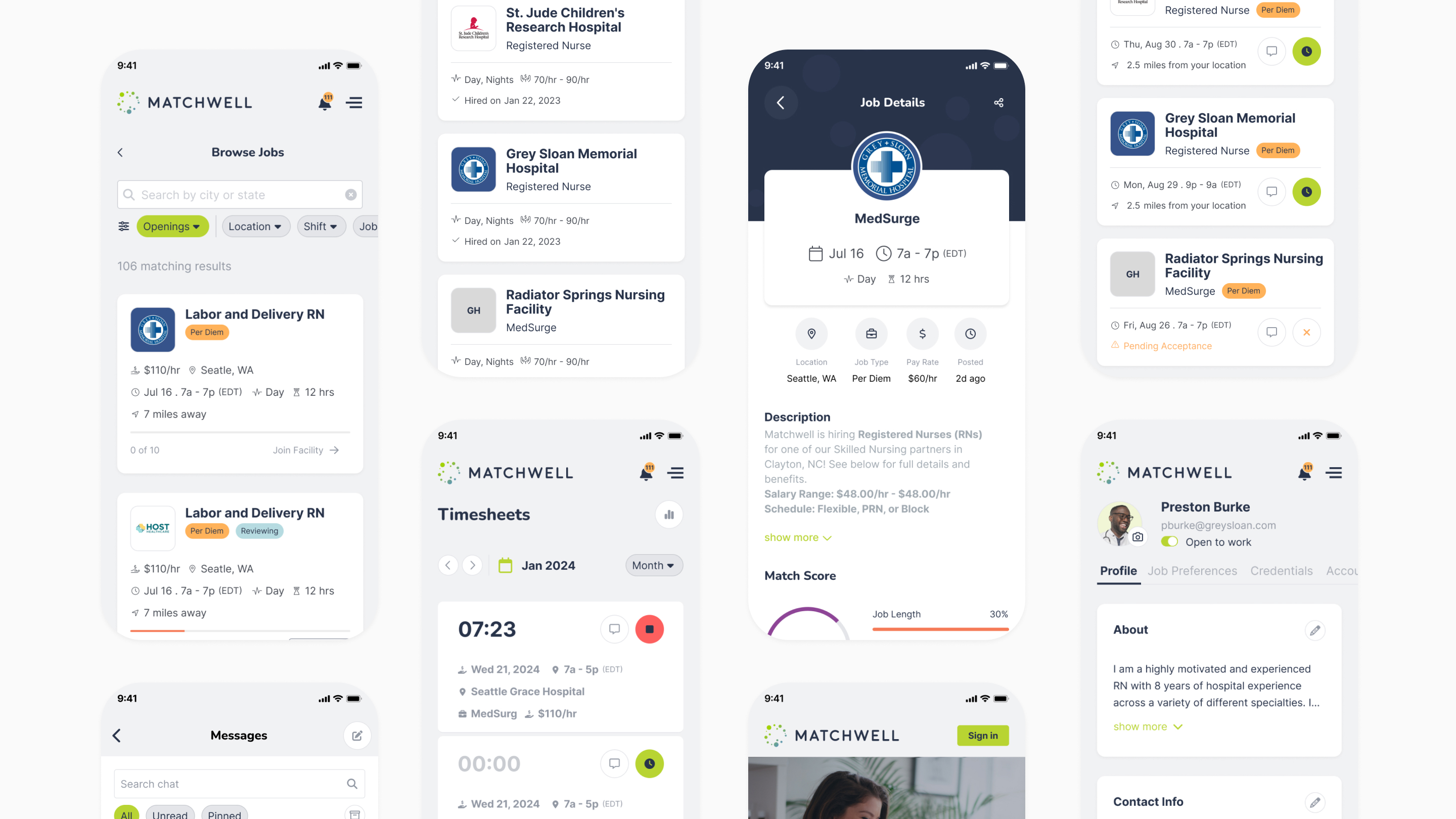
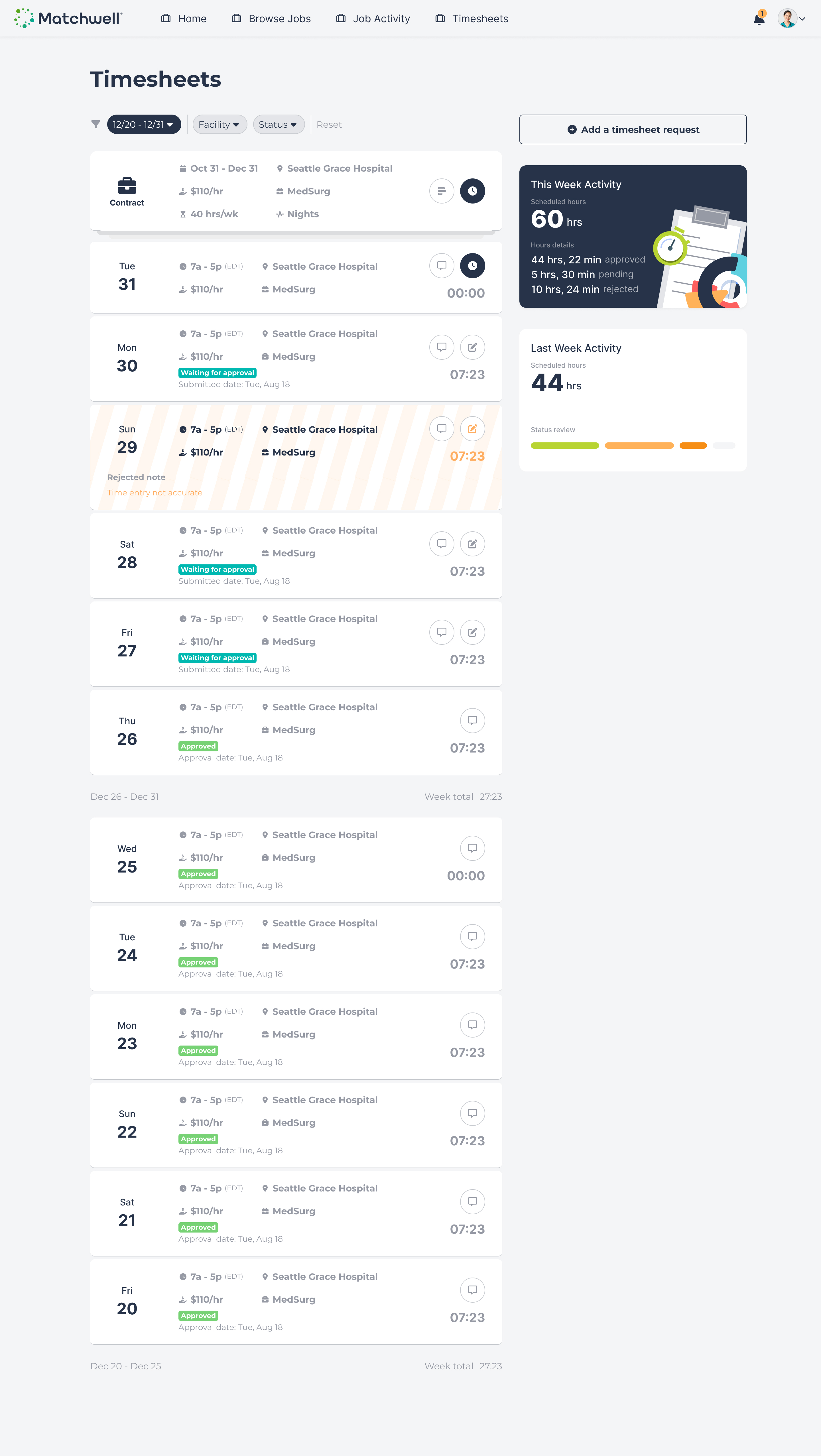
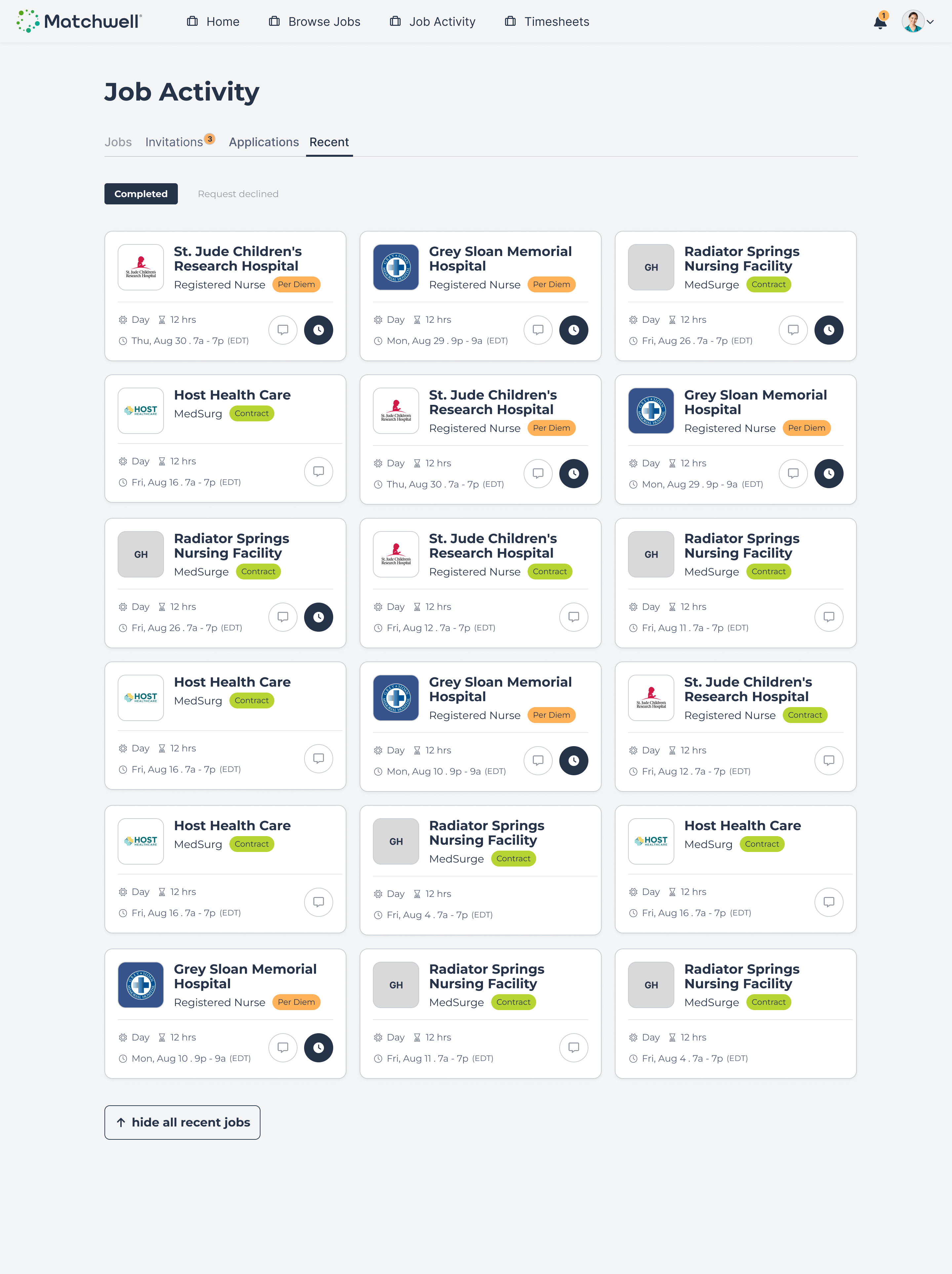
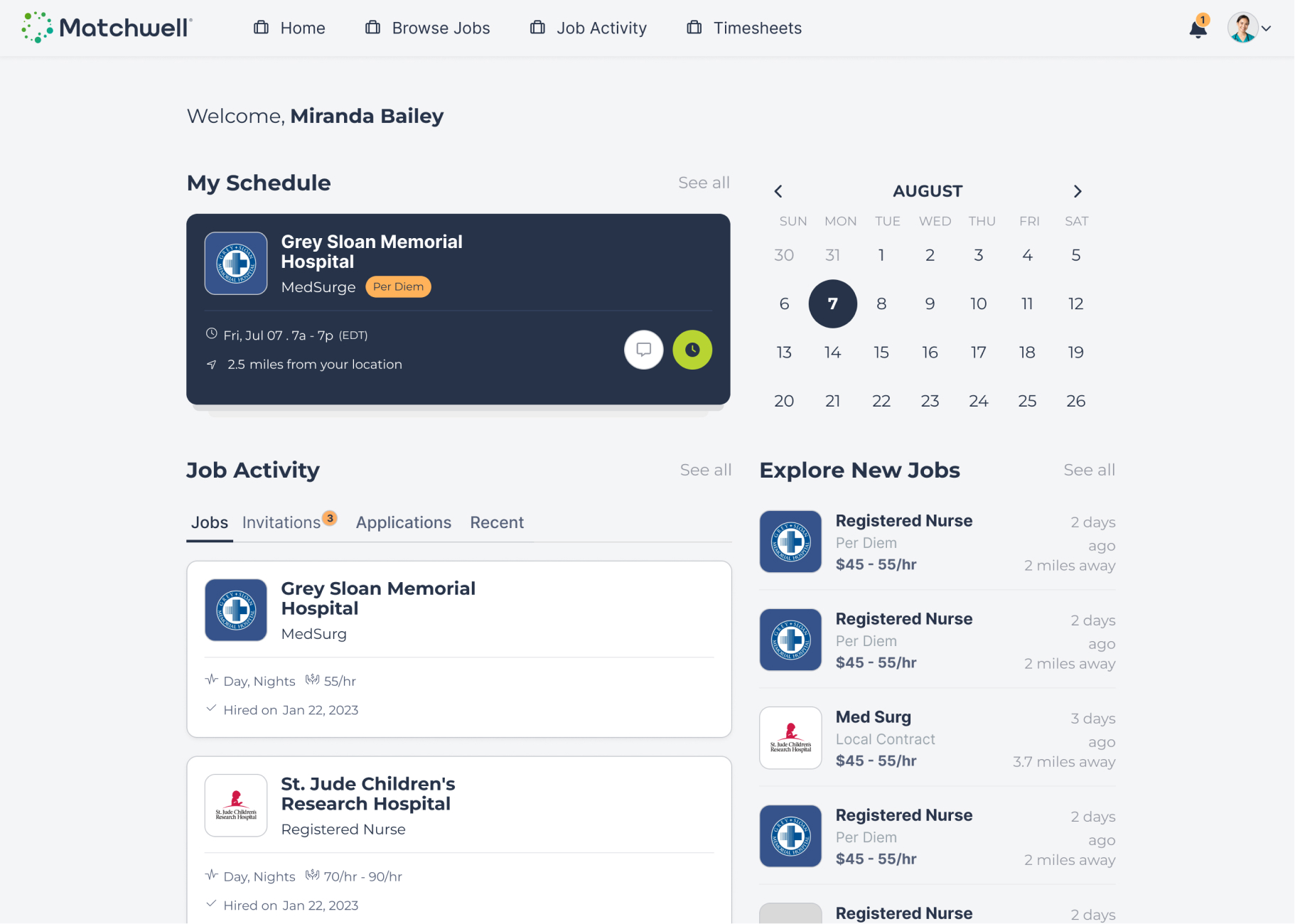
A unified job discovery experience I consolidated all opportunities into a single “Browse Jobs” page, establishing a clear and consistent entry point for job discovery.
Shifts and contracts live in the same list
- Filters allow users to narrow results when needed
- Color-coded badges clearly indicate:
- Job type (shift vs. contract)
- Whether the clinician is already contracted with the hospital
- This immediately removed ambiguity and reduced the need for users to interpret complex states.
Launch Project
Results & Impact
Following the launch of the redesigned Work App, the product saw clear improvements in both user engagement and operational efficiency.
- 50%+ increase in job applications after the redesign
- Significant reduction in support tickets related to job applications and timesheet submissions
- Positive qualitative feedback from clinicians, who reported that the app felt much easier and more intuitive to use
- Noticeably fewer questions from new users during onboarding
Support and Operations teams consistently shared direct user feedback highlighting increased confidence in completing tasks independently, reducing reliance on manual assistance.

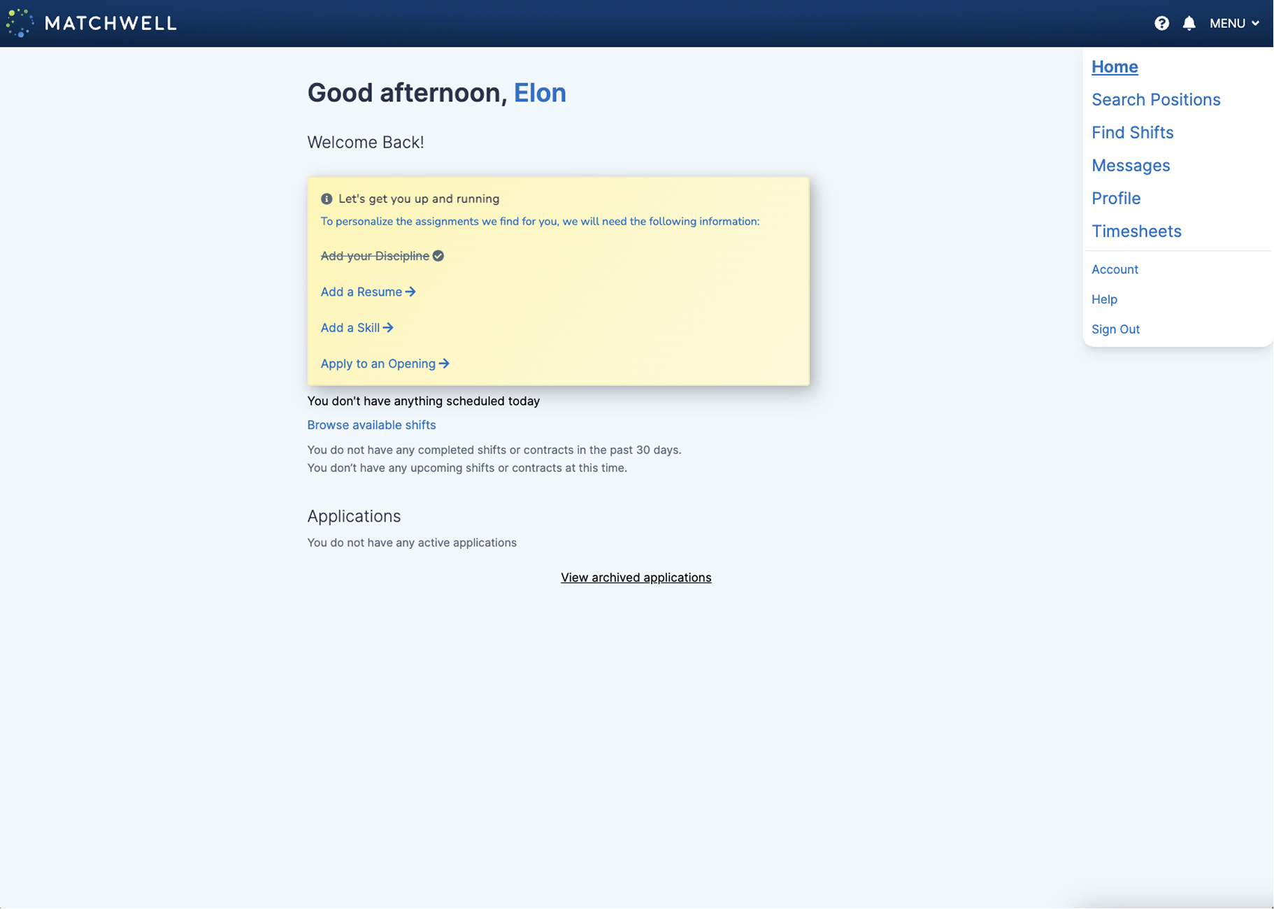
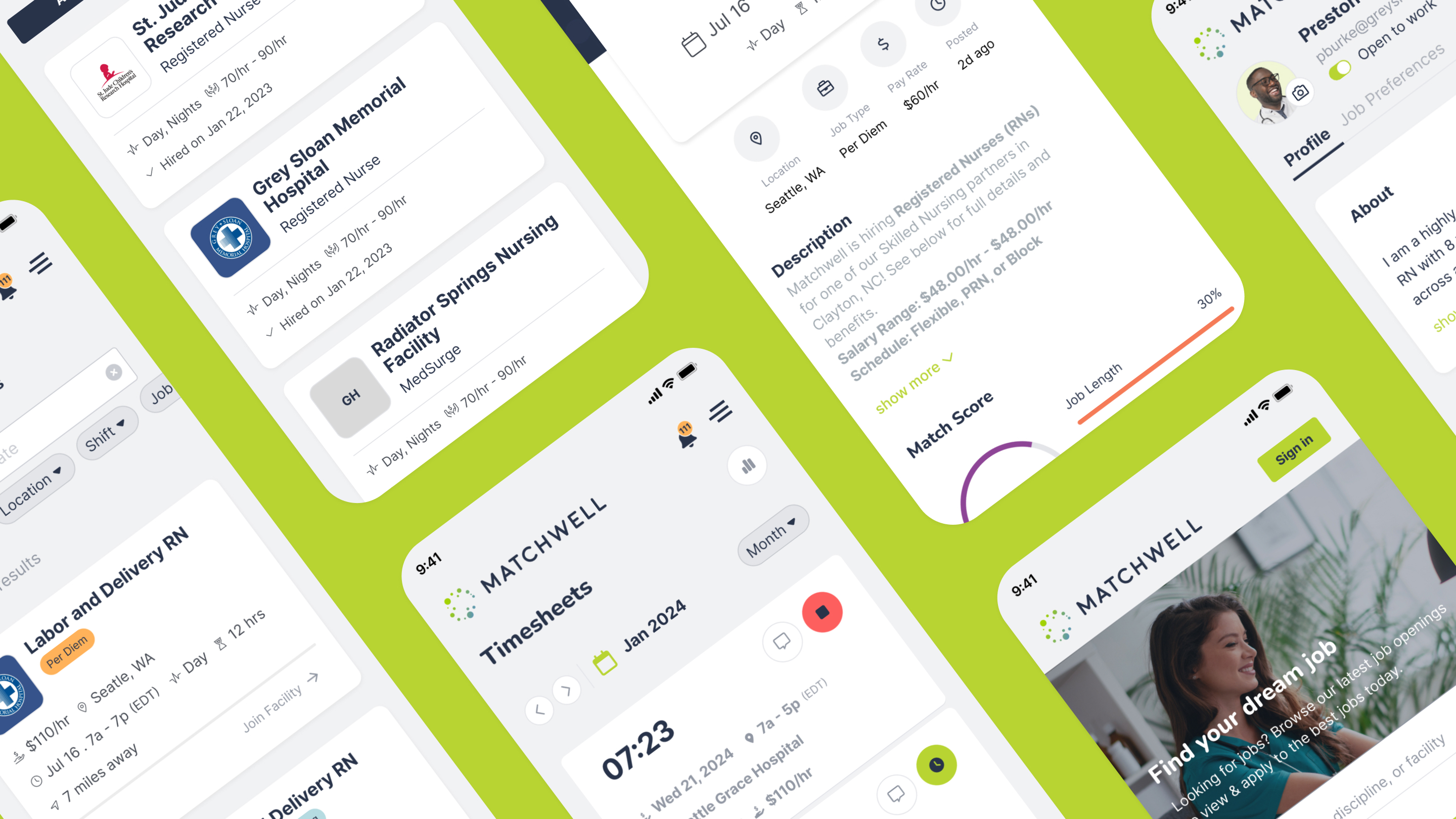
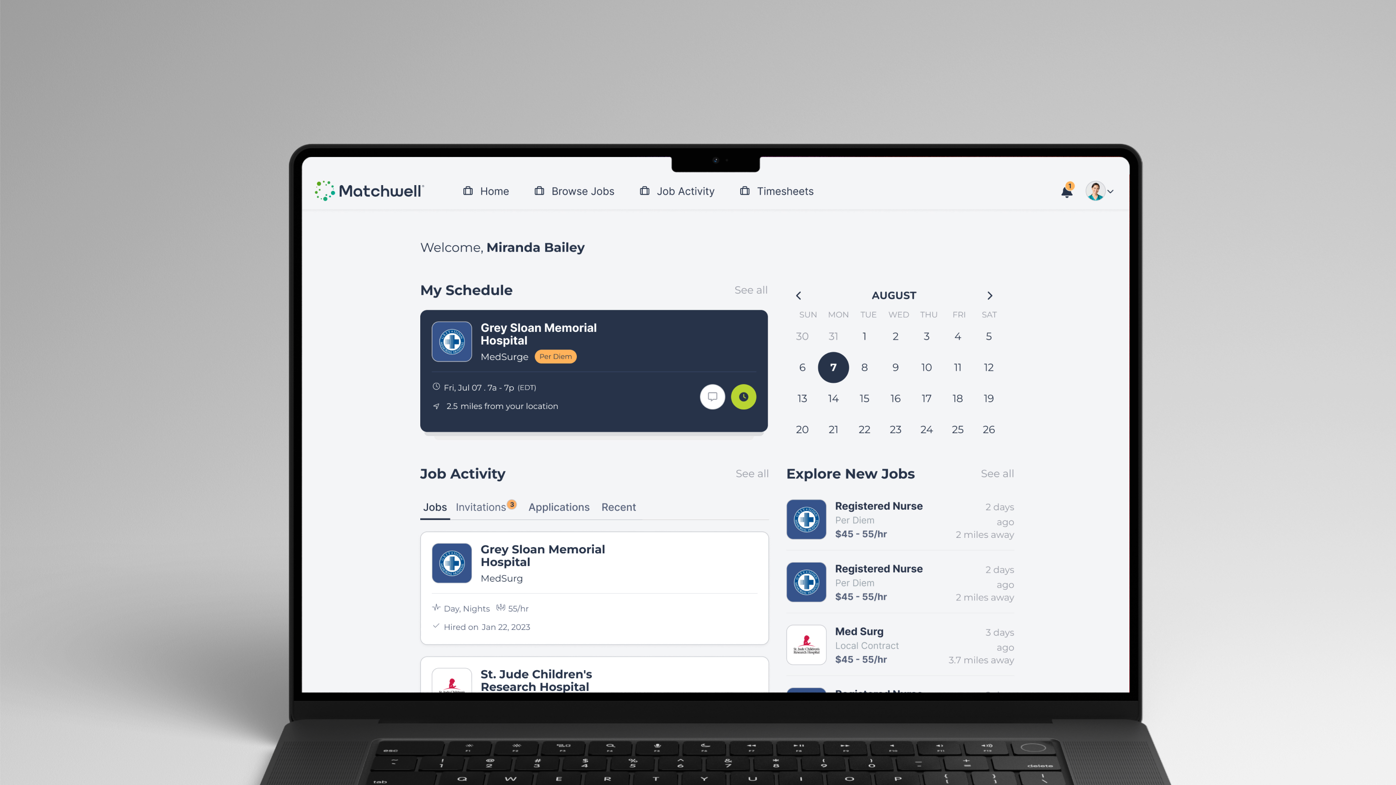
Before
After